Well, maybe. In an extended gamut world of RGB media interaction, there’s every expectation that nearly every “colour” we see should be reproducible across all mediums. That’s a naive expectation that colour professionals have a obligation to manage. First, the basics:
To simplify this exposition, let’s eliminate screen-viewed media. First of all, colour viewed as transmitted light versus reflected light, as with print media, is a subject all its own. Not only is the viewer’s perception changed by pixel excitation . . . okay – wait a minute with the flowery language. Let’s make this make at least a little sense.
RGB means “Red-Green-Blue” and that’s how colours are made on computer monitors. Little dots of light, or “pixels”, are arranged next to each other in computer displays and depending on how bright each of the pixels are, the eye and brain will understand that to be a certain colour.
CMYK means “Cyan-Magenta-Yellow-Black” (then why on earth is “K” black, huh? Don’t worry about that right now – printers have a jargon all their own that will be a great topic for later). In printing, those four inks are deposited on paper or plastic, usually, in tiny dots arranged near each other in varying sizes of bigger and smaller dots. When viewed from, say, a foot away, the eye and brain understand the light that’s reflected off the material being printed on as colour.
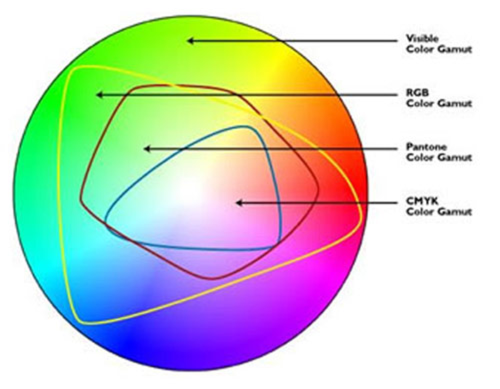
So far, so good. Now, the way those two systems are different is that RGB can display a much wider range of colours than CMYK. So, a “hot pink” can be displayed on a computer screen, but the CMYK printing process can’t reach those extremes natively. Think of two buckets of ping-pong balls where RGB is the bigger bucket that CMYK’s smaller bucket fits into. Here’s an illustration from Minnesota’s MCAD that shows this relationship very well:
The visible colour gamut is pretty gigantic and the RGB colour gamut or range-map covers a lot of that area. The CMYK ink-printable area is much smaller. So, why not print in RGB? That’s because RGB presses haven’t been invented yet as RGB applies to transmitted light, like in a computer monitor.
As a note, there is a way to increase the ink-printed gamut by adding a few more inks, namely orange, green and violet. But not all shops have the hardware and software and colour knowledge to make this happen. That’s not a knock – most full-colour work at the time of this writing is printed as CMYK, but extended gamut printing has efficiencies in certain circumstances we won’t get into here.
If we want to match a Pantone spot in CMYK, that target has to fall inside of the CMYK gamut. That will give us about 61% or so of the Pantone coated book, not including pastels or metallics. By opting for extended gamut, I’ve been able (and others, too) to get about 91% of the Pantone book.
Since most commercial printers don’t routinely set up for extended gamut, the designer is obliged to work in CMYK for a predictable result since “converting” RGB to CMYK can result in hot, on-screen colours being reduced to flat tones that look nothing like what’s displayed on-screen.
So, what’s the solution? Well, managing expectations is one course but if brand colours are involved, the best, most repeatable route is to specified CMYK for whatever needs to appear that way, like pack shots or complex multi-spot images and custom-mixed spot inks for anything that must match exactly. The benefit is that spot inks can print as solids without tiny dots breaking up the colour and will be much more repeatable product to product and run to run than CMYK process simulations.